A frame can arrange the elements inside it automatically. Instead of dragging every price tag, badge, and text line into place — and re-doing it when content changes length — you pick a layout for the frame and it keeps its children arranged for you. This article walks through the four layout modes, what each is for, and how overflow, alignment, and sizing behave.
Select a frame and look at the Layout section in the properties panel. The Flow row has four options: Freeform, Column, Row, and Grid.
Freeform#
Every element sits exactly where you put it, at the position and size you gave it. Elements can overlap freely — later elements in the Elements tree paint on top.
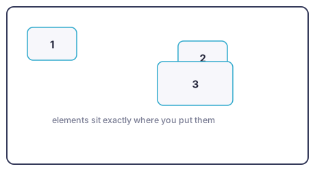
Use it for: hero compositions, a badge overlapping a product photo, backgrounds with content on top — anything where you want full manual control or deliberate layering.
Column and Row#
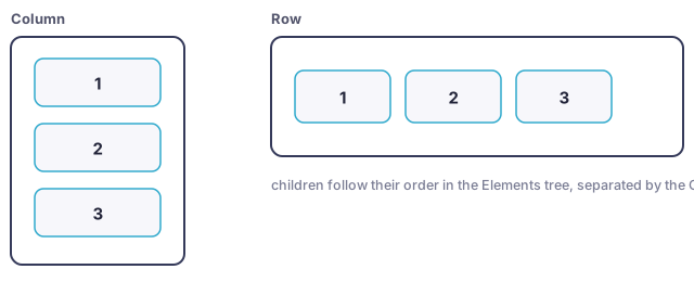
Children line up in a single stack — top to bottom for Column, left to right for Row — in their Elements-tree order, separated by the Gap you set. Move an element in the tree and it moves in the stack.
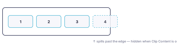
If the children need more space than the frame has, the stack simply continues past the frame's edge. Turn on Clip Content to hide the part that sticks out, or leave it off to let it show.
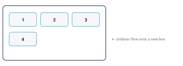
The Wrap toggle changes that: instead of spilling, children flow onto the next line when they run out of room.
Use them for:
- Row: a price next to a crossed-out original price, star rating next to a review count, a strip of feature icons.
- Column: a stack of text lines — headline, subline, price — that stays evenly spaced as content changes length.
- A badge or pill: a frame with a fill, rounded corners, padding, and a text child. The layout keeps the text centered, and with the frame set to hug its contents (see Sizing below) the pill grows and shrinks with the text.
Grid#
Grid divides the frame into equal cells and places one child per cell, in Elements-tree order, filling left to right and then moving down. You set the number of columns × rows in the Grid row — each side is either a number or Auto.
Both numbers set — a fixed number of slots. A 2 × 2 grid has exactly four slots. The frame is divided into four equal cells regardless of how many children there are; children beyond the last slot continue below the frame, where Clip Content hides them.
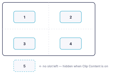
This makes a pinned grid the right tool whenever you want "show at most N": a 2 × 2 photo collage, a row of up to three badges (3 × 1), a list of up to four selling points (1 × 4). If fewer children are visible than there are slots, the extra slots simply stay empty — the remaining children don't spread out to fill them.
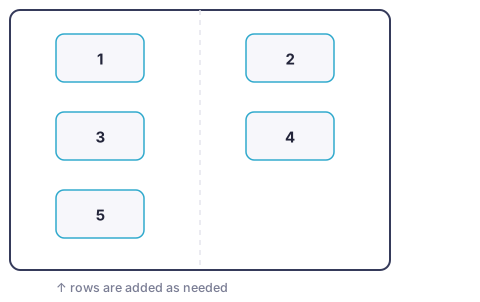
Columns set, rows Auto. The frame keeps a fixed number of columns and adds rows as needed, each row as tall as its tallest child. Nothing is cut off — the grid just grows downward (and past the frame's edge if it must).
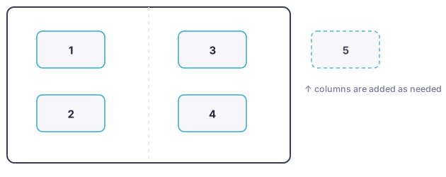
Rows set, columns Auto. The mirror image: children fill top to bottom, a fixed number per column, and new columns are added to the right.
Use it for: product photo collages, badge grids, comparison layouts — and any Column- or Row-like layout where you want a hard cap on how many items can appear.
Grids and automations work together#
Grid slots are filled by the children that are actually visible. If an automation hides an element for a product (see Automations), the remaining children shift up to fill its place. Combined with a pinned grid, this gives you "show whichever of these apply, up to four": add six possible badges to a 2 × 2 grid, let automations hide the irrelevant ones per product, and the first four visible badges take the slots.
Alignment, gap, and padding#
All three apply in every layout mode except Freeform:
- Alignment positions children inside the space they're given — in a Column or Row, along the stack; in a Grid, inside each cell. A smaller-than-cell image can sit in the cell's corner, center, or edge.
- Gap is the spacing between children (a Grid has separate row and column gaps). In a Column or Row you can also switch the gap to Auto to spread children out evenly across the frame.
- Padding insets all children from the frame's edges — essential for badges and pills.
How sizing works#
Elements keep the size you gave them — layouts position children, they don't resize them. An element that is bigger than its row, column, or grid cell overflows it rather than being squeezed to fit. That's deliberate: your design never gets distorted; if something doesn't fit, make the child smaller or the frame bigger.
The exception is text elements and frames, which can hug their contents: with the frame selected, the width and height fields in the Transform section have a small menu offering Fixed or Hug contents (available while the element sits inside a layout frame). A hugging pill grows with its text; a hugging text element takes exactly the space its content needs — and in a Row, a hugging text element wraps its text to the space that's left. Also see Elements for the auto font size option, which does the reverse: keeps the box fixed and fits the text to it.
Which layout should I use?#
| You want | Use |
|---|---|
| A layered composition — badge over photo, text over background | Freeform |
| A stack of text lines with even spacing | Column |
| Price + original price side by side | Row |
| A pill or badge that grows with its text | Row or Column, with padding and Hug contents |
| A photo collage with a fixed shape | Grid with columns × rows set |
| "Show at most N badges/selling points" | Grid with columns × rows set, plus automations |
| A gallery that grows with its content | Grid with rows (or columns) on Auto |
Tips#
- Element order is layout order. Drag rows in the Elements panel to reorder a stack or re-slot a grid.
- Per-size layouts: by default a frame uses the same layout in every template size. The link icon in the Layout section header switches the frame to a per-size layout, so a frame can be a Row in a wide banner and a Column in a tall one (see Sizes and formats).
- Clip Content is the overflow switch. In every mode it decides whether anything outside the frame's bounds is visible. For "show at most N" designs, turn it on.
Next steps#
- Elements — the building blocks you'll be arranging, and frames as "shapes with content"
- Automations — show and hide elements per product
- Sizes and formats — per-size layout differences across banner formats